The Workflow Designer is an interactive, visual page within Business Central that allows users to build and maintain Configure-to-Order workflows. Each workflow defines the sequence of configuration steps a sales user follows when configuring an item — selecting options, entering parameters, providing customisation text or images, and choosing components.
The designer renders the workflow as a directed, hierarchical diagram . Users interact with the diagram by clicking nodes (steps) and connectors (options) and then using the action bar to add, edit, or remove elements.
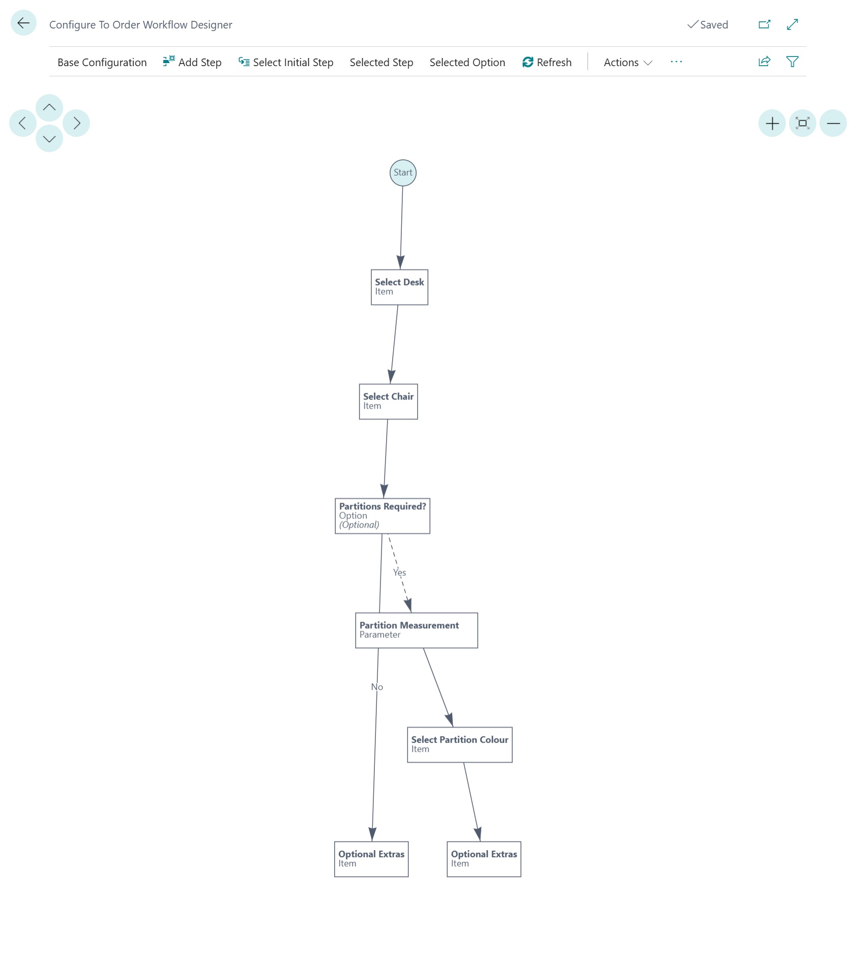
Nodes
Each node on the diagram represents a single workflow step. The node displays:
- Step description — the translated name of the step (bold)
- Step type — e.g. Option, Item, Resource, Parameter, Customisation
- Additional info — such as "(Optional)" when applicable (italic)
Node colours indicate status:
| Colour | Meaning |
|---|---|
| Teal circle | Start node — entry point of the workflow. Hovering shows base items, resources, and production operations. |
| White box | Configured step — the step has the required data defined. |
| Red box | Warning — the step is missing required data (e.g. no options, no items, no parameters). |
Connectors
Arrows between nodes show the navigation path through the workflow.
| Style | Meaning |
|---|---|
| Solid line | Default option path — the option pre-selected when the step is first displayed. |
| Dashed line | Non-default option path — the user must actively select this option. |
Connectors that represent step options display the option name as a label. Hovering over a connector shows a tooltip listing option components (items, resources) and production operations.
Tooltips
Hovering over any node or connector displays a rich tooltip showing the detailed configuration for that element. Tooltips include component lists, character-length constraints, and parameter definitions.
Workflow Step Types
Option Step
Presents a list of predefined choices. The user selects one (or more, if multiple selections are enabled). Each option can branch to a different next step, enabling conditional workflow paths.
- Supports a Default Option
- Optional steps can be skipped
- Multiple selections with min/max limits
Item Step
Prompts the user to select one or more items from a curated list. Supports item variants. The tooltip lists all available items with their numbers and variant codes.
Item (Attribute Filtered) Step
Same as the Item step type but the available items are filtered based on item attributes, providing a dynamic selection list.
Resource Step
Prompts the user to select one or more resources (e.g. labour, services) from a curated list. Only visible for assembly-order workflows.
Parameter Step
Collects numeric or text input from the user. Parameter values drive calculations such as component quantities via formula expressions. Each parameter can be marked as optional.
Customisation (Text) Step
Allows the user to enter free-form text (e.g. engraving, label printing). Supports minimum and maximum character-length constraints, with an option to include or exclude spaces from the count.
Customisation (Images) Step
Allows the user to upload one or more images as part of the configuration (e.g. a custom logo). The tooltip lists available image slots.
Production Operation Step
Selects a work or machine centre operation. Only visible for production-order workflows.
See Workflow Step Types for more information on steps that can be added.
Designer Actions
| Action | Description |
|---|---|
| Base Items | Manage items that are always included in every configuration regardless of user selections. |
| Base Resources | Manage resources always included. Only visible for assembly-order workflows. |
| Base Production Operations | Manage routing operations always included. Only visible for production-order workflows. |
Workflow Step Step actions
| Action | Description |
|---|---|
| Add Step | Opens a new Step Card to create a workflow step. The step is not connected to the diagram until a "Next Step" link is established. |
| Remove Step | Deletes the selected step (with confirmation). Enabled only when a step node is selected. |
| Step | Opens the Step Card for the selected step node, allowing the user to edit its properties. |
Workflow Step Option Option actions
| Action | Description |
|---|---|
| Add Step Option | Opens a new Step Option Card to add a selectable option to the currently selected step. Enabled only when a step is selected. |
| Remove Step Option | Deletes the selected step option connector (with confirmation). Enabled only when a connector is selected. |
Configuration Flow control
| Action | Description |
|---|---|
| Select Initial Step | Chooses which step the configurator shows first when a user starts configuring an item. The Start node connects to this step. |
| Select Next Step (Step) | Sets the default next step for the selected step node. Creates a connector from the selected step to the chosen target step. |
| Select Next Step (Option) | Sets the next step for the selected option connector. Allows conditional branching — different options can lead to different steps. |
| Calculation Placeholders | Opens the Calculation Variables page where formula variables (used in quantity and pricing calculations) are defined. |
Components Option-level
| Action | Description |
|---|---|
| Option Items | Manage items associated with the selected step option. These items are added to the assembly/production order when the option is selected. |
| Option Resources | Manage resources associated with the selected option. Assembly-order workflows only. |
Production Operations Production only
| Action | Description |
|---|---|
| Option Production Operations | Manage routing operations associated with the selected option. Only visible for production-order workflows. |
Language & Diagram
| Action | Description |
|---|---|
| Select Language | Changes the diagram's display language. Step and option descriptions are shown in the selected language using CTO Workflow Translations. |
| Refresh | Redraws the entire diagram to reflect any changes made outside the designer (e.g. via step/option cards). |
Interaction Model
| Click Target | Effect | Enabled Actions |
|---|---|---|
| Node (step) | Selects the step. Highlights the node. | Step, Remove Step, Add Step Option, Select Next Step (Step) |
| Connector (option) | Selects the option. Highlights the connector. | Remove Step Option, Select Next Step (Option), Option Items, Option Resources, Option Production Operations |
| Background | Clears the selection. | Only always-available actions (Add Step, Base Configuration, etc.) |
Multi-Language Support
The designer supports displaying step descriptions, option labels, parameter names, and item descriptions in any language configured in the Workflow Translations table. Translations allow prompts and information to be shown in the user language and documenation to be produced in the customer's language.
Use the Select Language action to switch the diagram's display language. The current user's language is selected automatically when the page opens. This allows you to check the translations are correctly assigned. If no translation exists for a given element, the default description is displayed.